0-1 Design system
Design system
UX/UI design
Responsive design

quick summary
Navigating rapid growth and efficiency challenges
At OwnSpace I worked in a fast-growing team that needed both systematic improvements and speed. Within just six months, our team size had doubled, and we were preparing to launch two new products.
As the team grew, maintaining design consistency became increasingly challenging. High-fidelity mockups often resulted in prolonged discussions and back-and-forth during hand-offs with developers. With two new products on the horizon, these inconsistencies became more pronounced, raising usability concerns.
To address these challenges, I proposed and implemented a responsive design system to enhance product usability for our users and streamline team workflows.
MY ROLE
UX/UI Designer
Workshop facilitator
Team
Alex - Product manager
tiMELINE
4 weeks
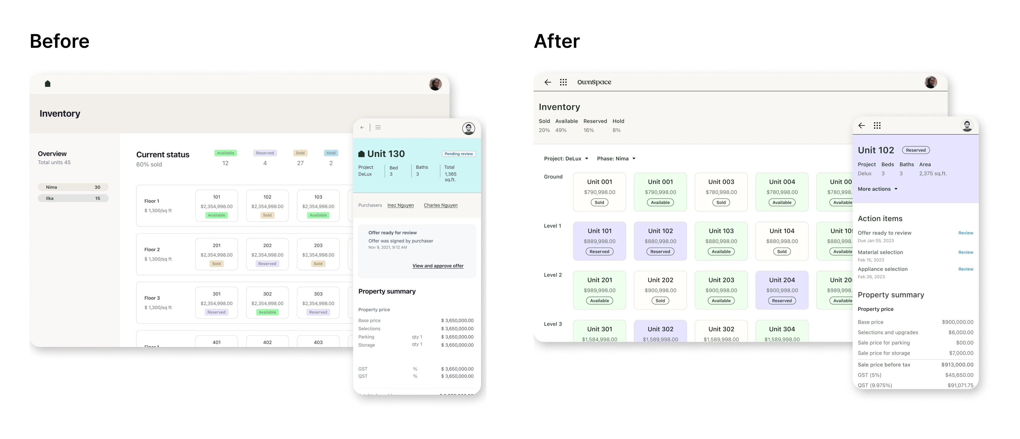
Inconsistent designs across our products caused navigation challenges for users and weakened brand recognition. Internally, duplicated efforts and fragmented workflows created inefficiencies, emphasizing the need for a unified design approach.
PROBLEMS
Design inconsistencies impact navigation issues and brand recognition
Usability testing showed that users experienced navigation challenges due to inconsistent design elements, such as multiple button styles creating confusion about the primary CTA. Additionally, inconsistent visuals across products weakened brand recognition, emphasizing the need for a unified identity.

Repetitive asset creation increased inconsistencies and decreased team efficiency
Through one-on-one interviews with our designers and developers, I uncovered significant workflow challenges. Recreating assets for each project was common, resulting in duplicated efforts, inconsistencies, and unnecessary time spent on repetitive tasks.

DESIGN sOLUTIONS
A style guide for brand recognition
I collaborated with the brand team to address the user’s feedback on brand inconsistency. Through extensive visual explorations, I ensured our designs reflected the brand’s essence across both existing and upcoming products.

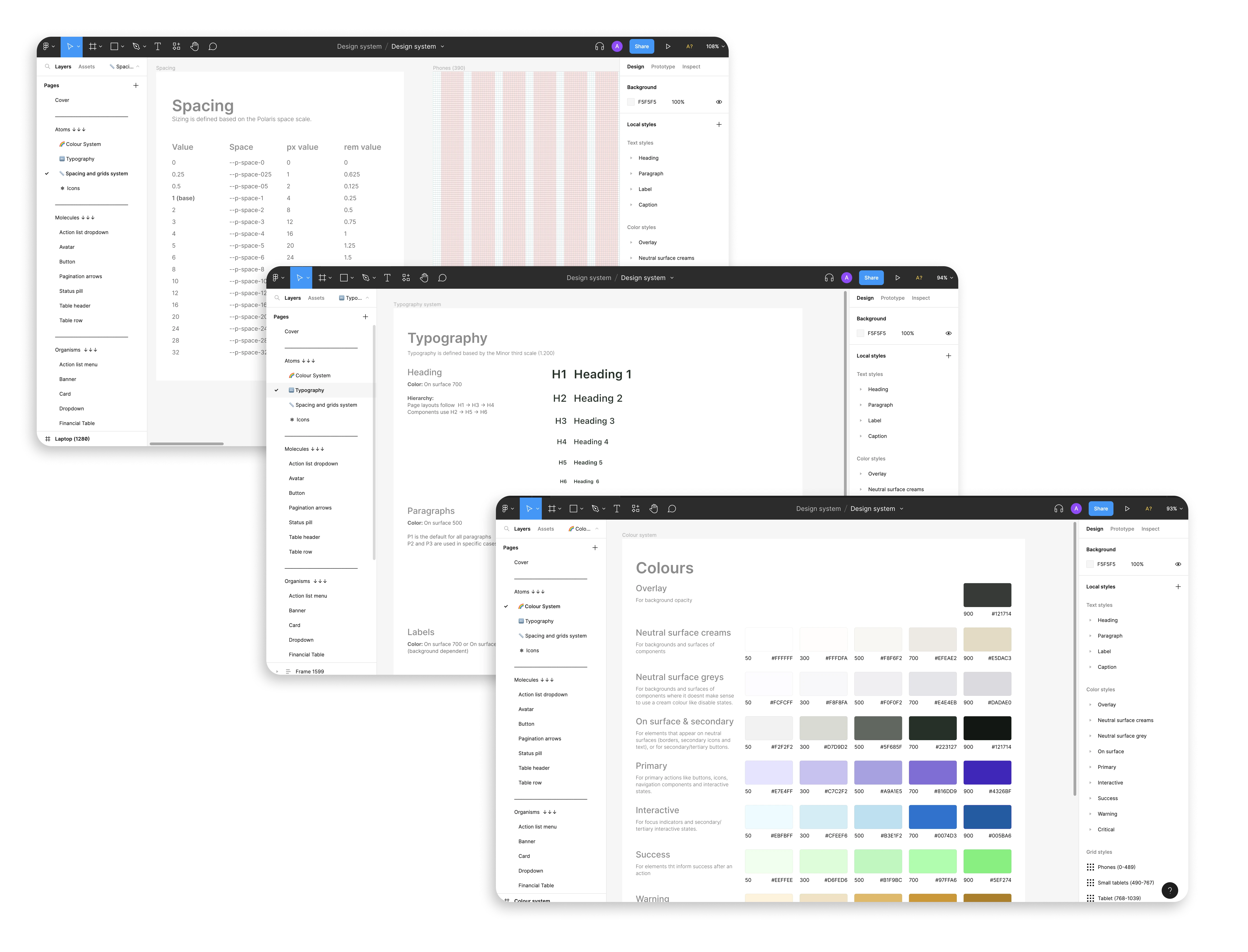
Spacing and grid system: To ensure scalability, I implemented Polaris 4-point grid system, offering flexibility as the design system grows.
Typography system: Aligning with the branding team’s choice of SF Pro Text, I refined header, paragraph, and label styles for readability across mobile and desktop.
Colour system: While following brand guidelines, I identified accessibility issues with some colour combinations. Collaborating with the brand team, I adjusted the palette to enhance text-background contrast for better usability.
A component library for faster iteration
By prioritizing components identified in our audit, I established a foundation for the design system. This minimized redundant work, enabled faster iterations, and provided clear resources that improved collaboration.

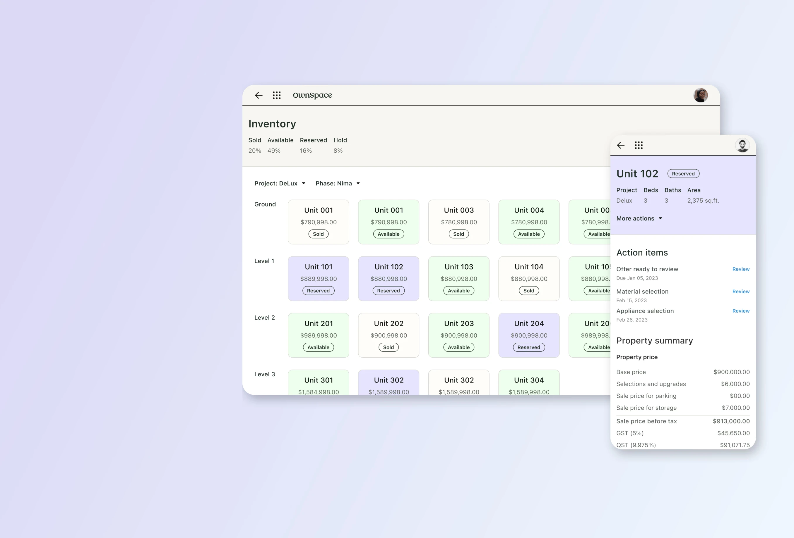
Headers: Colour-coded status indicator
I designed two header variations: a default header for general use and a property header that adapts its colour based on a property's status. By adding a status pill alongside the colour changes, I ensured clarity and accessibility, allowing users to understand a property's availability quickly.

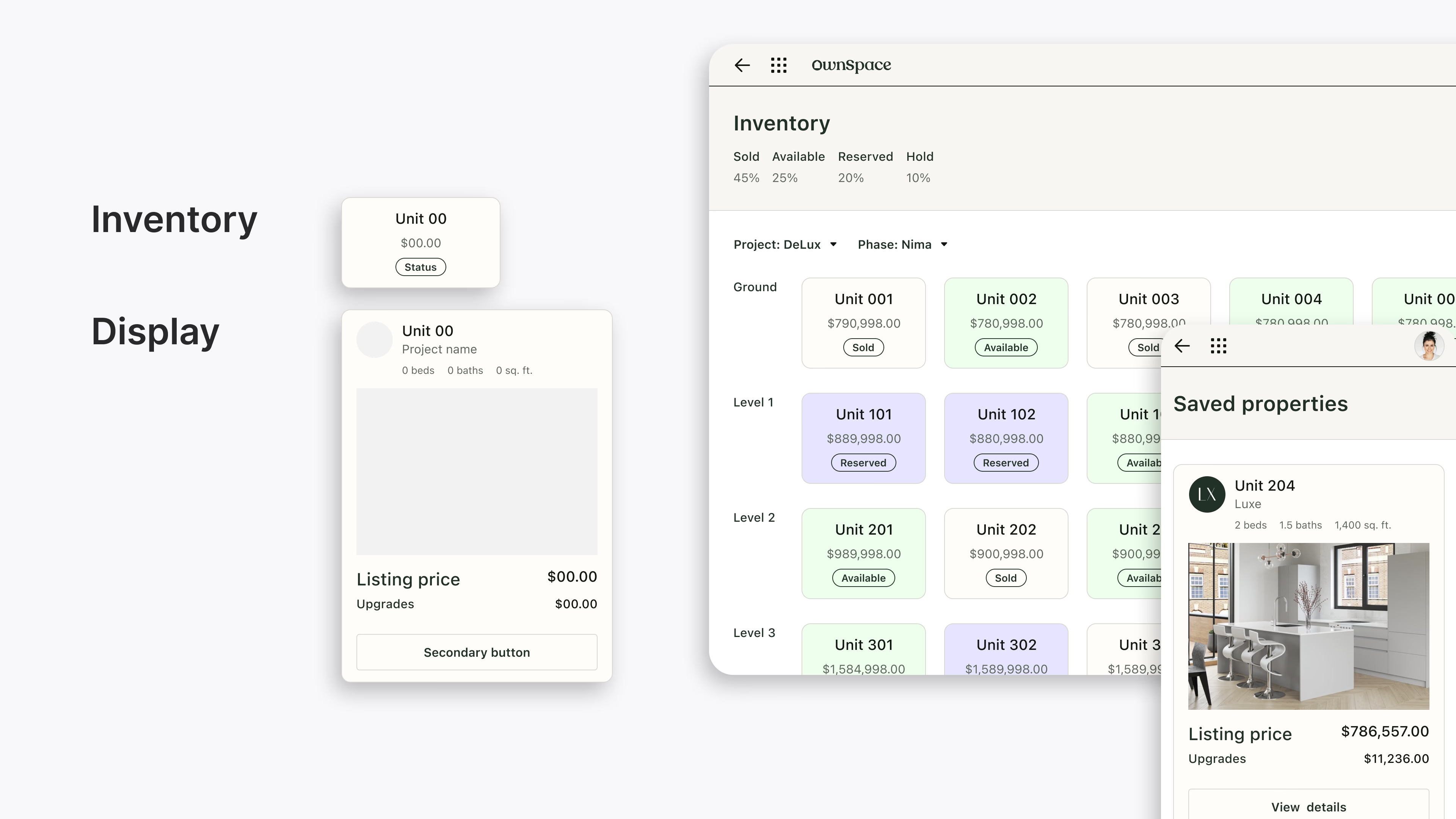
Cards: Streamlined usage and function
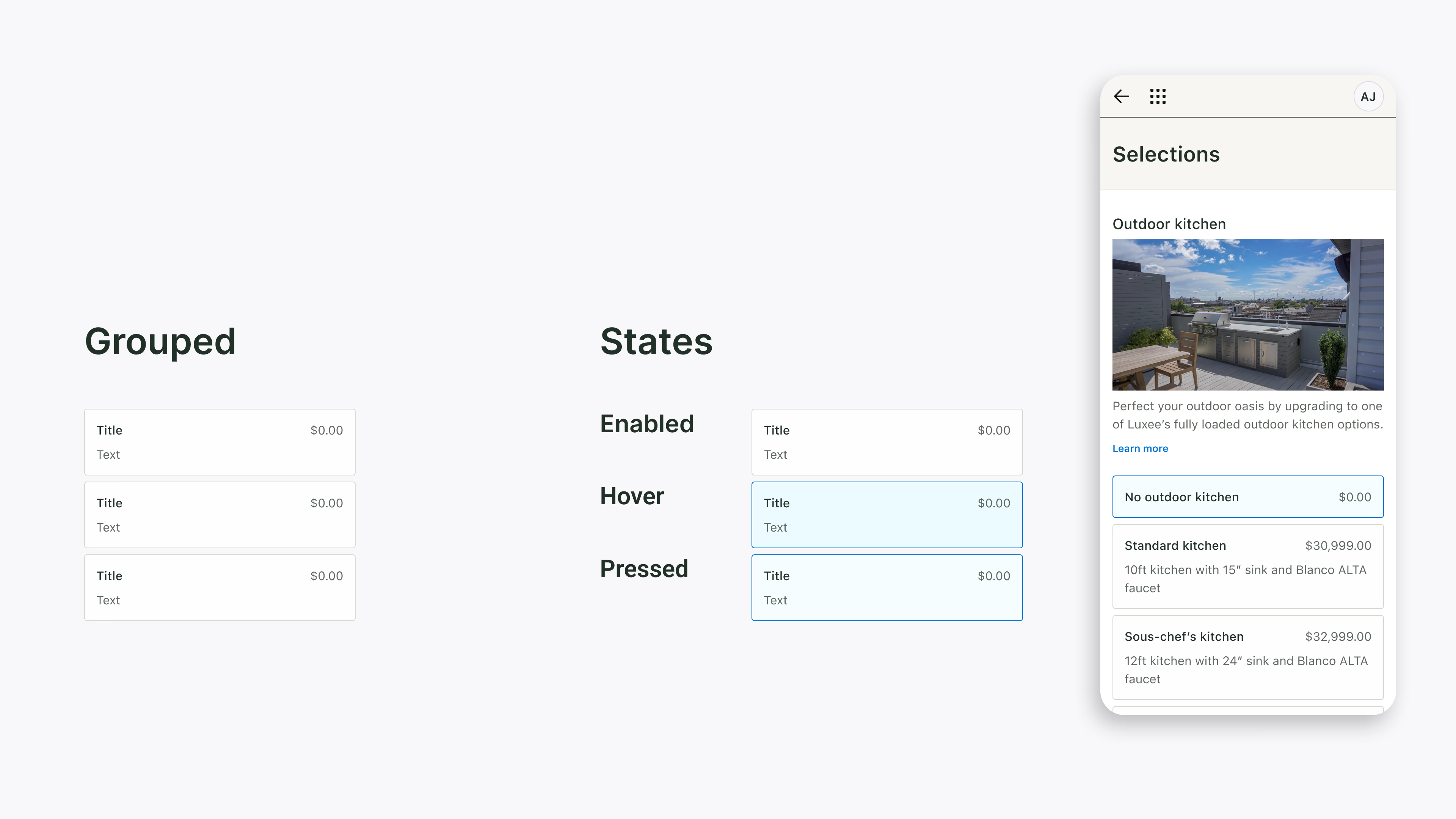
I redesigned card components to resolve overuse and inconsistent functionality, focusing on property cards for showcasing properties and selection cards for user choices. Distinct visual styles and usage guidelines ensured both card types were clear, purposeful, and adaptable to various contexts.
A slack channel to grow the system as a team
The launch of our design system was a pivotal moment, but its success depended on ongoing team adoption and collaboration. To support this, I led workshops to introduce the system and promote a shared stewardship model, replacing the single gatekeeper approach.
A dedicated Slack channel became the hub for the design system’s evolution, enabling transparent updates, team contributions, and feedback on designs. This collaborative approach fostered a sense of ownership and collective responsibility, ensuring the design system continued to grow as an integral part of our workflow.

Impact
Improved navigation & design consistency across products
The design system standardized components and assets, ensuring consistent visuals and seamless navigation across all products.
Reduced design to production time by 33%
Streamlined workflows and ready-to-use assets cut design time by 1-2 weeks, enabling faster hand-offs to developers
100% adoption of the design system by the team
Workshops and structured processes drove full team adoption within two weeks, with designers and developers actively contributing to the system by the first month.


02 / 02
UX design
UI design
APP design
UX design
[Next project]
Streamlining deals
0-1 Design system
Design system
UX/UI design
Responsive design
quick summary
Navigating rapid growth and efficiency challenges
At OwnSpace I worked in a fast-growing team that needed both systematic improvements and speed. Within just six months, our team size had doubled, and we were preparing to launch two new products.
As the team grew, maintaining design consistency became increasingly challenging. High-fidelity mockups often resulted in prolonged discussions and back-and-forth during hand-offs with developers. With two new products on the horizon, these inconsistencies became more pronounced, raising usability concerns.
To address these challenges, I proposed and implemented a responsive design system to enhance product usability for our users and streamline team workflows.
MY ROLE
UX/UI Designer
Workshop facilitator
Team
Alex - Product manager
tiMELINE
4 weeks
Inconsistent designs across our products caused navigation challenges for users and weakened brand recognition. Internally, duplicated efforts and fragmented workflows created inefficiencies, emphasizing the need for a unified design approach.
PROBLEMS
Design inconsistencies impact navigation issues and brand recognition
Usability testing showed that users experienced navigation challenges due to inconsistent design elements, such as multiple button styles creating confusion about the primary CTA. Additionally, inconsistent visuals across products weakened brand recognition, emphasizing the need for a unified identity.
Repetitive asset creation increased inconsistencies and decreased team efficiency
Through one-on-one interviews with our designers and developers, I uncovered significant workflow challenges. Recreating assets for each project was common, resulting in duplicated efforts, inconsistencies, and unnecessary time spent on repetitive tasks.
DESIGN sOLUTIONS
A style guide for brand recognition
I collaborated with the brand team to address the user’s feedback on brand inconsistency. Through extensive visual explorations, I ensured our designs reflected the brand’s essence across both existing and upcoming products.
Spacing and grid system: To ensure scalability, I implemented Polaris 4-point grid system, offering flexibility as the design system grows.
Typography system: Aligning with the branding team’s choice of SF Pro Text, I refined header, paragraph, and label styles for readability across mobile and desktop.
Colour system: While following brand guidelines, I identified accessibility issues with some colour combinations. Collaborating with the brand team, I adjusted the palette to enhance text-background contrast for better usability.
A component library for faster iteration
By prioritizing components identified in our audit, I established a foundation for the design system. This minimized redundant work, enabled faster iterations, and provided clear resources that improved collaboration.
Headers: Colour-coded status indicator
I designed two header variations: a default header for general use and a property header that adapts its colour based on a property's status. By adding a status pill alongside the colour changes, I ensured clarity and accessibility, allowing users to understand a property's availability quickly.
Cards: Streamlined usage and function
I redesigned card components to resolve overuse and inconsistent functionality, focusing on property cards for showcasing properties and selection cards for user choices. Distinct visual styles and usage guidelines ensured both card types were clear, purposeful, and adaptable to various contexts.
A slack channel to grow the system as a team
The launch of our design system was a pivotal moment, but its success depended on ongoing team adoption and collaboration. To support this, I led workshops to introduce the system and promote a shared stewardship model, replacing the single gatekeeper approach.
A dedicated Slack channel became the hub for the design system’s evolution, enabling transparent updates, team contributions, and feedback on designs. This collaborative approach fostered a sense of ownership and collective responsibility, ensuring the design system continued to grow as an integral part of our workflow.
Impact
Improved navigation & design consistency across products
The design system standardized components and assets, ensuring consistent visuals and seamless navigation across all products.
Reduced design to production time by 33%
Streamlined workflows and ready-to-use assets cut design time by 1-2 weeks, enabling faster hand-offs to developers
100% adoption of the design system by the team
Workshops and structured processes drove full team adoption within two weeks, with designers and developers actively contributing to the system by the first month.

02 / 02
UX design
UI design
APP design
UX design
[Next project]