Buyer portal
B2C Tool
UX/ UI design
Journey Mapping
Testing

Designing a buyer portal to enhance the buyer experience and retention on a platform originally built for real estate developers. The project focused on addressing critical gaps to better support buyers in their journey.
quick summary
The buyer portal
Home buyers don’t purchase properties in one go; they need time to explore options and consult with partners before making a final decision. Our platform lacked the necessary features to support the home buyers’ journey, leading to a poor experience and a missed business opportunity. By engaging buyers within our platform, OwnSpace could provide real estate developers with access to a pool of active, potential buyers.
To solve this problem, I designed a buyer portal where buyers can track their saved properties, and offer progress within the platform.
Role
UX/UI Designer and researcher
tiMELINE
6 weeks

problem
Supporting home buyers beyond the checkout
The platform so far developed with OS direct customers in mind real estate developers to streamline their property selling process. However, another key actor in this flow is the buyer, our customer’s clients. At this time, our only buyer-facing product was the checkout flow. But there was nothing supporting buyers in their journey before or after they put an offer on a property.
Home buyers don't purchase properties in one go
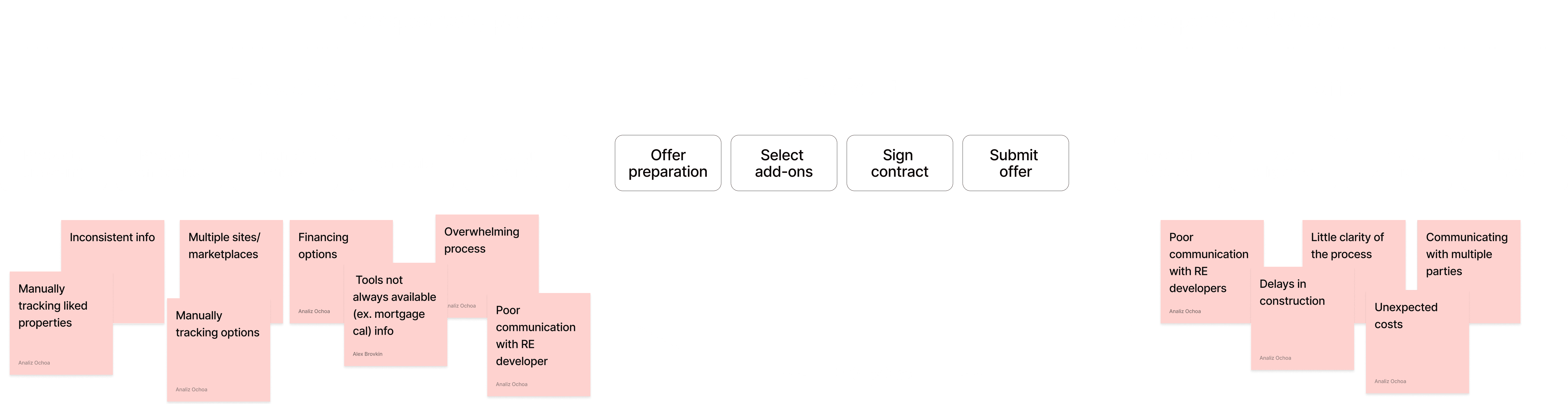
To better understand buyer pain points, I conducted interviews and usability tests, uncovering two main issues. First, buyers don’t purchase properties in one go—they need time to explore options. Second, after submitting a purchase offer, there is often miscommunication with the real estate developer until the purchase is finalized.
Business missed opportunity to engage and retain buyers
The gaps in the platform not only created a poor experience for home buyers but also represented a missed business opportunity for OwnSpace. Unless buyers were ready to make a purchase and go through the checkout process, they had no reason to engage with the platform. However, by bringing buyers into the platform early on we could offer real estate developers an additional benefit: access to a pool of home buyers actively looking to purchase.

Think about product scalability
When designing the buyer portal, scalability was a key consideration. While there were many big ideas and potential features to implement, as a startup, we needed to be selective with our focus. The goal was to prioritize features that would enhance the buyer’s journey now while also laying a solid foundation for future enhancements, ensuring we wouldn’t need to face complete rebuilds later on.

Design solutions
Structuring the buyer portal
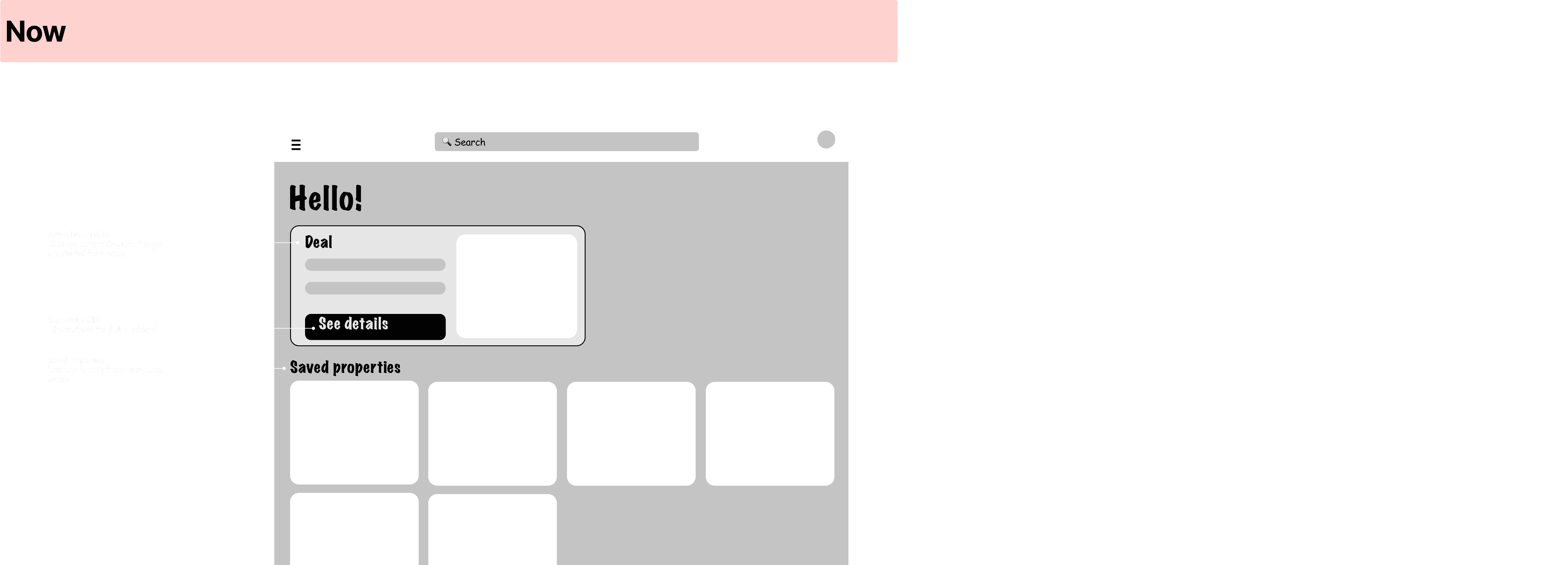
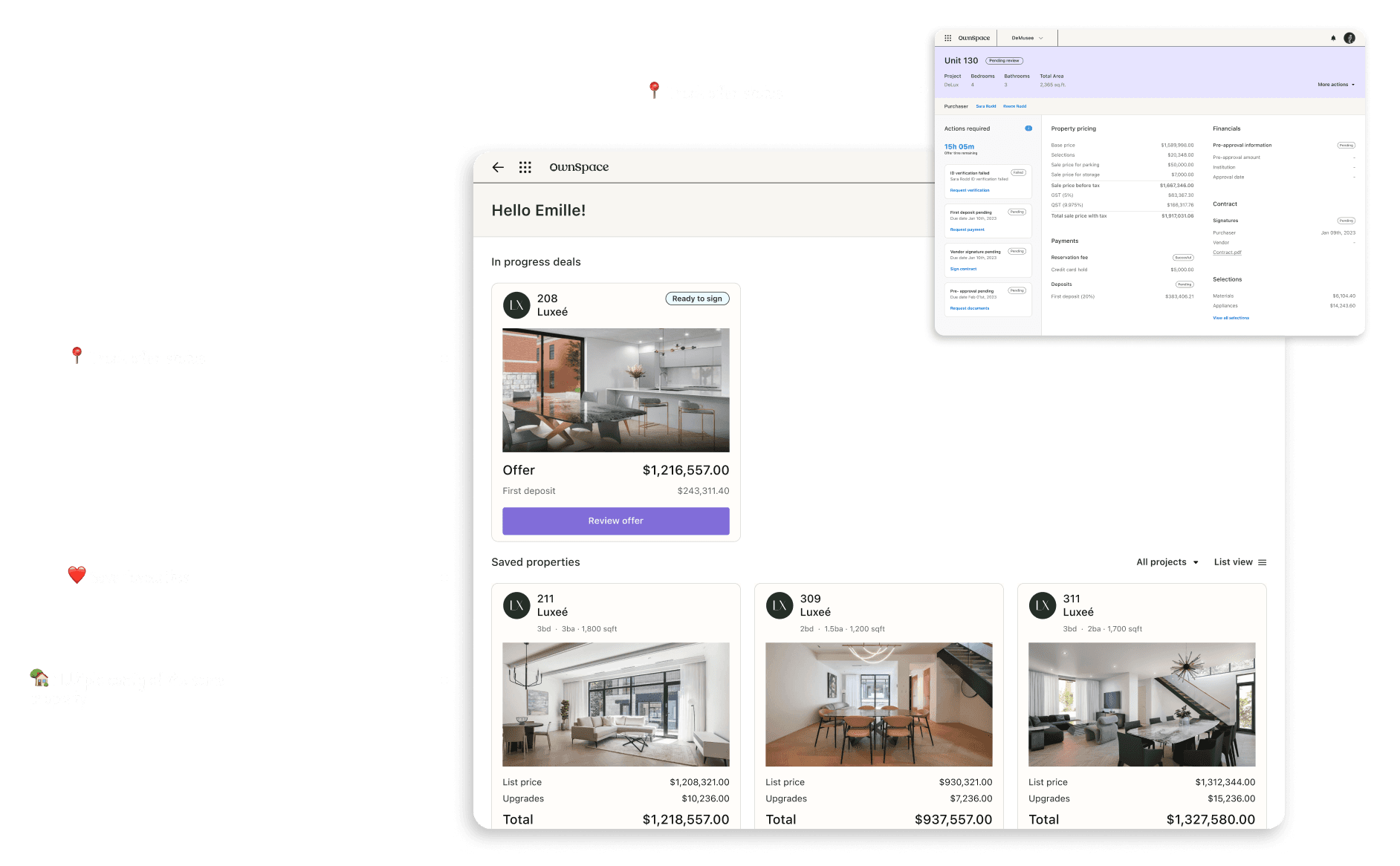
After research and discussions with the leadership team, the product manager and I prioritized a list of features to support buyers based on scope and dependencies. The resulting structure highlighted three essential sections for the buyer’s portal: a space for in-progress offers, a section for saved properties, and an area for the buyer's personal information.
We focused on features that would engage buyers during the browsing process, encouraging interaction with the platform before making a final decision on a property. Additionally, we implemented offer tracking features, streamlining basic communication between buyers and developers and reducing reliance on messy email threads.
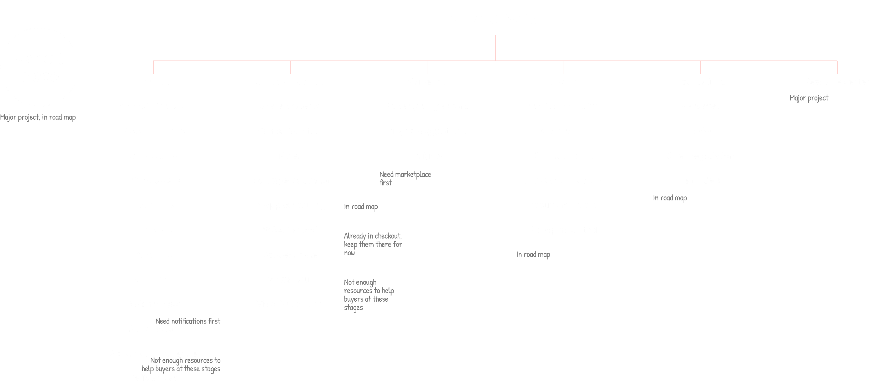
While wireframing the buyer portal, I explored different layout versions, balancing what the portal needed right now with a vision for its future evolution. I considered how the portal could support immediate buyer needs while maintaining a flexible structure to accommodate future features.

Connecting the buyer journey: from browsing to saved properties
From our research, we learned that buyers wanted to save their favourite properties during the browsing stage, which, from a business perspective, would help us engage and retain them throughout their journey. To address this, I collaborated with our engineering team to create a streamlined solution that integrated the different stages of the buyer’s browsing journey throughout our platform: starting from the marketing website where buyers explore properties, moving to the checkout app for making selections, and ultimately saving their property in their buyer portal.

From lists to property cards
For the UI, I moved away from the list format we use for developers, which is more data-driven and focused on numbers and sales. From our research, we learned that buyers engage more with properties through visuals rather than data alone. To address this, I introduced property cards into our design system to showcase saved properties and in-progress offers. This more visual approach allows buyers to easily identify their properties of interest at a glance, improving their overall experience.

Improving property comparison with a table view
Our research revealed that buyers want an easy way to compare the properties they’ve saved. While we plan to implement a side-by-side comparison tool for this purpose, it was out of scope for the current phase. However, during testing, we noticed that buyers struggled to compare property details within the card layout. To address this, we introduced a table view and filters for saved properties, making it easier to visually compare property details in the meantime.

Impact
Expanded the platform to support a new user segment
Within 6 weeks, the platform evolved from exclusively supporting developers to providing dedicated features and a tailored experience for buyers, unlocking a new user base and expanding the app's functionality.
90% feature adoption within 1 month
The platform so far developed with OS direct customers in mind real estate developers to streamline their property selling process.
Streamlined communication between buyers and developers
The buyer portal eliminated the need for long, fragmented email exchanges, enabling seamless and centralized communication between buyers and real estate developers.
Reduced support queries from buyers by 12%
As an added bonus, buyer support tickets related to offer status dropped by 12% after the portal launch, as users could now track the progress of their offers directly.

02 / 02
UX design
UI design
APP design
UX design
[Next project]
0-1 Design system
Buyer portal
B2C Tool
UX/ UI design
Journey Mapping
Testing
Designing a buyer portal to enhance the buyer experience and retention on a platform originally built for real estate developers. The project focused on addressing critical gaps to better support buyers in their journey.
quick summary
The buyer portal
Home buyers don’t purchase properties in one go; they need time to explore options and consult with partners before making a final decision. Our platform lacked the necessary features to support the home buyers’ journey, leading to a poor experience and a missed business opportunity. By engaging buyers within our platform, OwnSpace could provide real estate developers with access to a pool of active, potential buyers.
To solve this problem, I designed a buyer portal where buyers can track their saved properties, and offer progress within the platform.
Role
UX/UI Designer and researcher
tiMELINE
6 weeks
problem
Supporting home buyers beyond the checkout
The platform so far developed with OS direct customers in mind real estate developers to streamline their property selling process. However, another key actor in this flow is the buyer, our customer’s clients. At this time, our only buyer-facing product was the checkout flow. But there was nothing supporting buyers in their journey before or after they put an offer on a property.
Home buyers don't purchase properties in one go
To better understand buyer pain points, I conducted interviews and usability tests, uncovering two main issues. First, buyers don’t purchase properties in one go—they need time to explore options. Second, after submitting a purchase offer, there is often miscommunication with the real estate developer until the purchase is finalized.
Business missed opportunity to engage and retain buyers
The gaps in the platform not only created a poor experience for home buyers but also represented a missed business opportunity for OwnSpace. Unless buyers were ready to make a purchase and go through the checkout process, they had no reason to engage with the platform. However, by bringing buyers into the platform early on we could offer real estate developers an additional benefit: access to a pool of home buyers actively looking to purchase.
Think about product scalability
When designing the buyer portal, scalability was a key consideration. While there were many big ideas and potential features to implement, as a startup, we needed to be selective with our focus. The goal was to prioritize features that would enhance the buyer’s journey now while also laying a solid foundation for future enhancements, ensuring we wouldn’t need to face complete rebuilds later on.
Design solutions
Structuring the buyer portal
After research and discussions with the leadership team, the product manager and I prioritized a list of features to support buyers based on scope and dependencies. The resulting structure highlighted three essential sections for the buyer’s portal: a space for in-progress offers, a section for saved properties, and an area for the buyer's personal information.
We focused on features that would engage buyers during the browsing process, encouraging interaction with the platform before making a final decision on a property. Additionally, we implemented offer tracking features, streamlining basic communication between buyers and developers and reducing reliance on messy email threads.
While wireframing the buyer portal, I explored different layout versions, balancing what the portal needed right now with a vision for its future evolution. I considered how the portal could support immediate buyer needs while maintaining a flexible structure to accommodate future features.
Connecting the buyer journey: from browsing to saved properties
From our research, we learned that buyers wanted to save their favourite properties during the browsing stage, which, from a business perspective, would help us engage and retain them throughout their journey. To address this, I collaborated with our engineering team to create a streamlined solution that integrated the different stages of the buyer’s browsing journey throughout our platform: starting from the marketing website where buyers explore properties, moving to the checkout app for making selections, and ultimately saving their property in their buyer portal.
From lists to property cards
For the UI, I moved away from the list format we use for developers, which is more data-driven and focused on numbers and sales. From our research, we learned that buyers engage more with properties through visuals rather than data alone. To address this, I introduced property cards into our design system to showcase saved properties and in-progress offers. This more visual approach allows buyers to easily identify their properties of interest at a glance, improving their overall experience.
Improving property comparison with a table view
Our research revealed that buyers want an easy way to compare the properties they’ve saved. While we plan to implement a side-by-side comparison tool for this purpose, it was out of scope for the current phase. However, during testing, we noticed that buyers struggled to compare property details within the card layout. To address this, we introduced a table view and filters for saved properties, making it easier to visually compare property details in the meantime.
Impact
Expanded the platform to support a new user segment
Within 6 weeks, the platform evolved from exclusively supporting developers to providing dedicated features and a tailored experience for buyers, unlocking a new user base and expanding the app's functionality.
90% feature adoption within 1 month
The platform so far developed with OS direct customers in mind real estate developers to streamline their property selling process.
Streamlined communication between buyers and developers
The buyer portal eliminated the need for long, fragmented email exchanges, enabling seamless and centralized communication between buyers and real estate developers.
Reduced support queries from buyers by 12%
As an added bonus, buyer support tickets related to offer status dropped by 12% after the portal launch, as users could now track the progress of their offers directly.

02 / 02
UX design
UI design
APP design
UX design
[Next project]